Corsair Sample Project
Testing my visual design skills - Revamping icons
Roles
Visual Design
Iconography
UX/UI Design
Tools
Trusty Sketchbook
A Pencil
Adobe Illustrator
Timeline
June 10th-12th, 2022
Introduction
Scott Hartley, the Senior Visual Designer at Corsair, tasked me with a design challenge: Improve on the designs of the icons on the website's community sub-menu. It was a simple iconography challenge, but I certainly felt the self-imposed pressure. I only had to recreate 3-5 icons, but I like my final prototype to be consistent so I redid all of them!
Taking a closer look
Below is a screenshot of the current Corsair website with the Community page icons. I noted some key observations about these icons that later influenced the redesigns to better match Corsair's branding and make the user experience more enjoyable.
1. Sharp corners
2. Lack of Consistency
3. Flatness
All of the icons have sharp corners in their design. While this is simply stylistic choice, the new UI/UX trend is to have rounder corners in iconography. This can trigger the Kiki effect where the user can associate sharpness with a sense of danger or seriousness.
The current icons utilize different styles of design. Some edges are sharper, some are rounder, some strokes are left unfinished, and some strokes are not the same thickness.
I enjoy the simplicity of the icons, but ultimately it is very gray. Considering that I associate Corsair with RGB lightshows in PC builds, it's odd that this area feels very flat. The gray gradient attempts to add dimension to the icons but it can only do so much.
Sketches
There were a few main changes I wanted to make when it came to the icon redesigns: (1) modernizing, (2) adding more depth, (3) colorizing. After mentally visualizing the redesigns and sleeping on it, I took it to my sketchbook.

Corsair Gaming
If you have to use language to make an icon, it's not an effective icon! I took inspiration from the NIGHTSWORD gaming mouse because a mouse is a pretty universal icon that allows you to navigate anything online. If the page is called "Corsair Gaming," it should be an icon that is uniquely Corsair. I considered doing a Corsair headset icon, but it might be associated with customer support.

Esports
I liked the trophy icon but wanted to make it more dynamic. Esports can get super intense, so why not depict the rewards? Let's add a hand taking the W.

Streamers
Streamers are people, so let's add a person in a video player. This interface is something most stream viewers recognize. Let's remove the antennas too because it seems traditional.

Students
The students icon stood out the most because its iconographic design is completely different from the others (unfinished strokes, sharp edges, diagonals). I kept the graduation cap and made it more modern and refined.

Forum
The current forum icon is good. I just made the design style consistent with the other redesigns.

Blog
I changed the document to a browser since it is an online blog format. I kept the pencil because it is a universal blog/edit icon.

Wallpapers
The current icon is a universal image icon. It's versatile, but I want to make it PC-specific. I put the image icon inside a monitor and gave it curves. I thought about using the hexagonal pattern that Corsair likes to use, but it would be too complex for an icon. I based the monitor silhouette on the Corsair Xeneon.

Press Room
Super universal design for a press icon. I just made it feel more complete and removed the extra lines to add space.
Illustrator time
I took pictures of my sketches and imported them into Adobe Illustrator. I proceeded to trace over the sketches. The main tools I used were the pen tool, anchor tool, shape tool, and the shape builder tool.


Then I used the Corsair Yellow to add in color.


Final prototype
I edited them into their environment for better context. Overall, I think my redesign of the icons feel more cohesive, lively, and modern. It was previously hard to notice that the brand accent color for Corsair is yellow. The colorful icons now give larger emphasis to branding.
It feels more dynamic. It feels fresh. It feels uniquely Corsair.
Bonus challenge
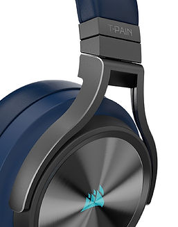
Scott also gave me a bonus challenge of editing this photo of T-Pain with blue Virtuoso headsets instead of gray ones. Good thing I love Photoshop and the color replacement brush.
Before and Reference Photo
.jpg)
.jpg)
After
